I've been immersed in the creation of the latest Lilla Rogers Global Talent Search competition assignment. I am LOVING it! I realize how much I have learned and how far I have come. I'm going to bravely share my past submissions and go through where I was at the time - creatively and technically. I want to show, mainly myself, how very far I have come in five years!
My entry in the 2013 Global Talent Search
This make me cringe a bit. We had to design a journal cover with the theme of vintage playground. I did not know or even have Photoshop on my computer. I did not have my own computer or scanner! I had to carefully paint this with brand new gouache and then take it to Staples to have it scanned. I had just taken MATS A (the very first MATS class) and cried every week because I couldn't make my ideas look as cool as some of the more tech-savy artists. The only week I felt good about during that class was wall art because I was a fine artist, that's what I did. But, I completed this assignment with the know-how I had at the time and gave it my 110%. No, I did not make it through to the next round. But, I remember having fun. And I did love my palette. I admired the artists whose work rose above the crowd and used it as motivation to keep going. I knew my voice was forming and I just needed to keep working.
My entry for the 2014 GTS
In 2014 we had to design a piece with the terrarium theme and hand lettering. I don't remember much about this brief. This year I had learned some photoshop from a generous and patient friend but I was still quite a novice. I hand painted this piece in sections. The background pattern was in gouache on paper and the terrarium and cup were done in acrylic on wood board. Again, I think my concept was original and my color palette was pretty good but my technical skills were not yet there. I Definitely did not include enough icons to chew on! No, I did not make it through to the next round. I could see the artists whose work was picked and could see why Lilla fell in love with their work.
My submission for the GS 2016
In 2015 the theme was to design a cup, saucer and paper ware for a tea shop in London. I loved doing the research for this one and really let my imagination go. I had just started an obsession with drawing and painting moths so I went in that direction and used metamorphosis as my theme. Again, I really took my time with this and put in all my soul and energy into this piece. I remember loving the result. Again, I did not make it through the first cut. At the time I was crushed because I truly felt mine could hang with the fifty artists who got through. With time though, I have gained some perspective and can see that I wasn't quite there yet. I should have mocked up my tea cup and I should have included a whole lot more icons. I was going for simplicity and elegance and that's not necessarily what was selling at the time. Again, I kept going and building my skills with gouache, and Photoshop. I went to school to get a certificate in Graphic Design and I took a bit of a breather from the Make Art That Sells community so that I could find my own voice and explore things on my own for a bit.
I really do feel like a completely different artist now than I was then. My skills with Photoshop have gone from an awkward necessity to an integral tool in my tool box. I have also learned to use Illustrator in ways I could never believed I was capable of. I've honed my design skills and continued to push myself towards a more authentic voice.
I'm proud of my design this year. I will share it after July 9th. I think I've come a long way, Baby!
I want to say that I think it was a healthy choice to take a bit of a break from the MATS community to find my own way for a bit. I am thrilled to be back in the fold again. I have taken the Children's Book Illustration class and have signed up for the Money Badass class which starts in August. I'm back with a vengeance!
Oh! And I have fallen in love with my dip fountain pen! I just want to draw and hand letter with it all day long!!!
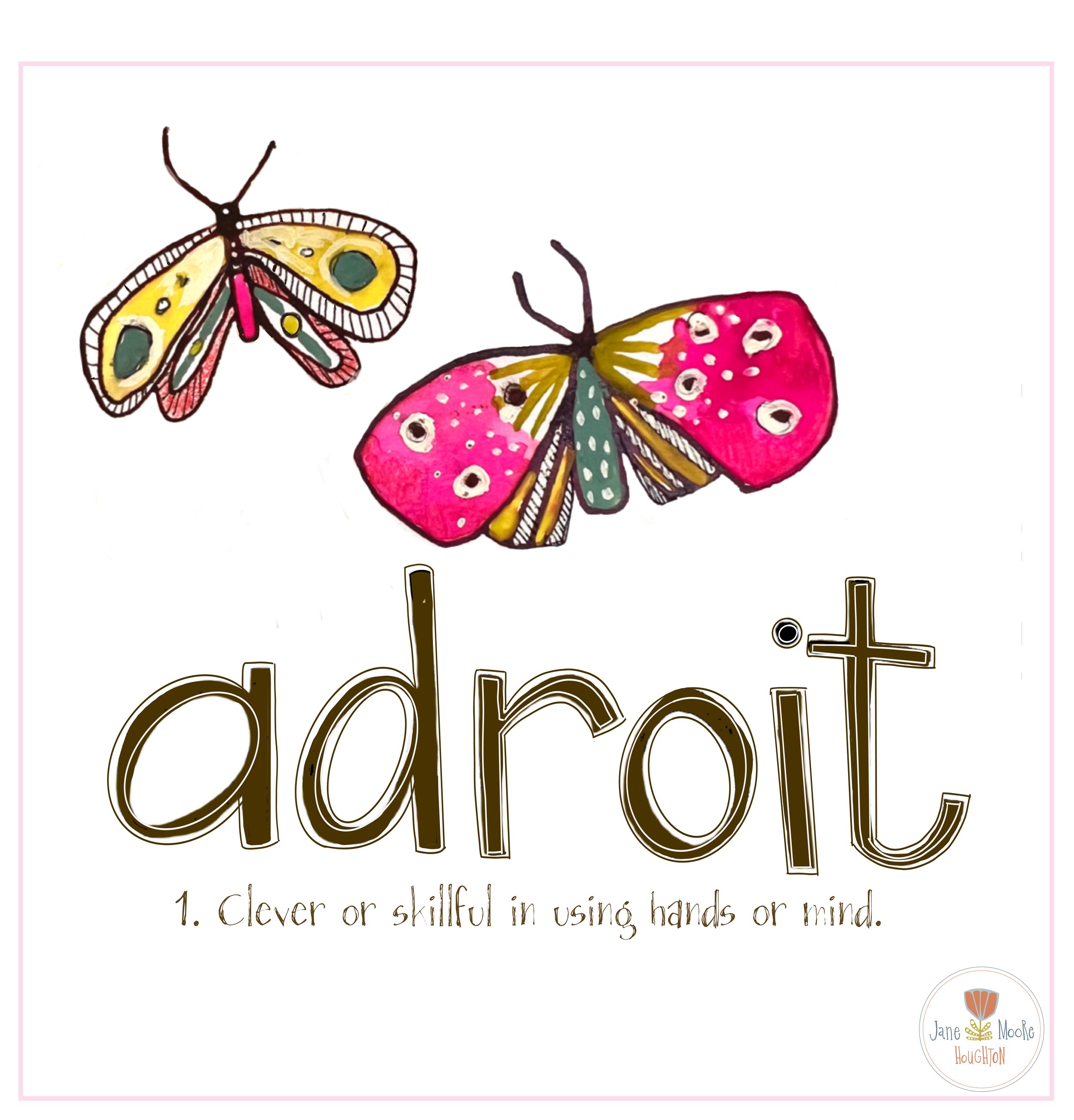
My mantra during this GTS
