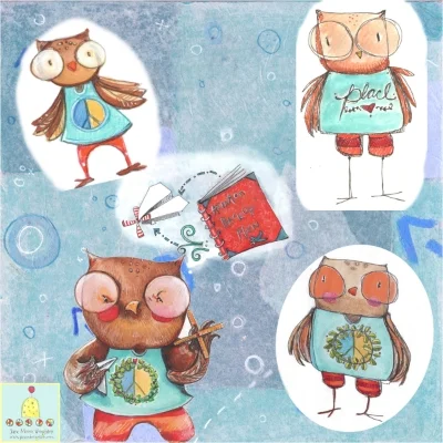
So, if you remember my post from last week, I am crafting a character loosely based on my son, Parker. This character is a crafty, out-of-the-box thinker who loves to learn all kinds of things. He gets so excited about the current thing he is interested in that everything else he's "supposed" to be doing gets ignored. I have been sketching and tweaking and even trying new materials to get just the right look for this guy. Here is where I started:
The concept started with loose sketches that I did while listening to my son and his friends perform at an open mic night at his school.
I drew up four options in color; some looser than others. I tried painting directly on vellum, an idea I heard from Jake Parker on the Stories Unbound podcast. It gives a smoother result and a cleaner "cut" on Photoshop.
My challenge at this point was to gather the aspects I liked from the above versions while maintaining a grounded, confident style. I've been thinking a lot lately about maintaining a "grounded" nature to my work. What do I mean by this? When I look at some illustrators or commercial artists who I admire; it's the confidence that shines through in their work that I strive to maintain in my own work, much more than the work itself. When I look back through my sketchbooks or pieces I have hanging in my studio, I can tell when I was in the moment with the attempts or when I was rushing for a particular job or if I was just not feeling it that day. It doesn't matter if I'm looking at work from today in a doodle I did while waiting on the phone or if I did it years ago: I can tell when I wasn't in the moment. My goal is to get more and more consistent with that grounded nature. Maybe every artist strives for this forever?
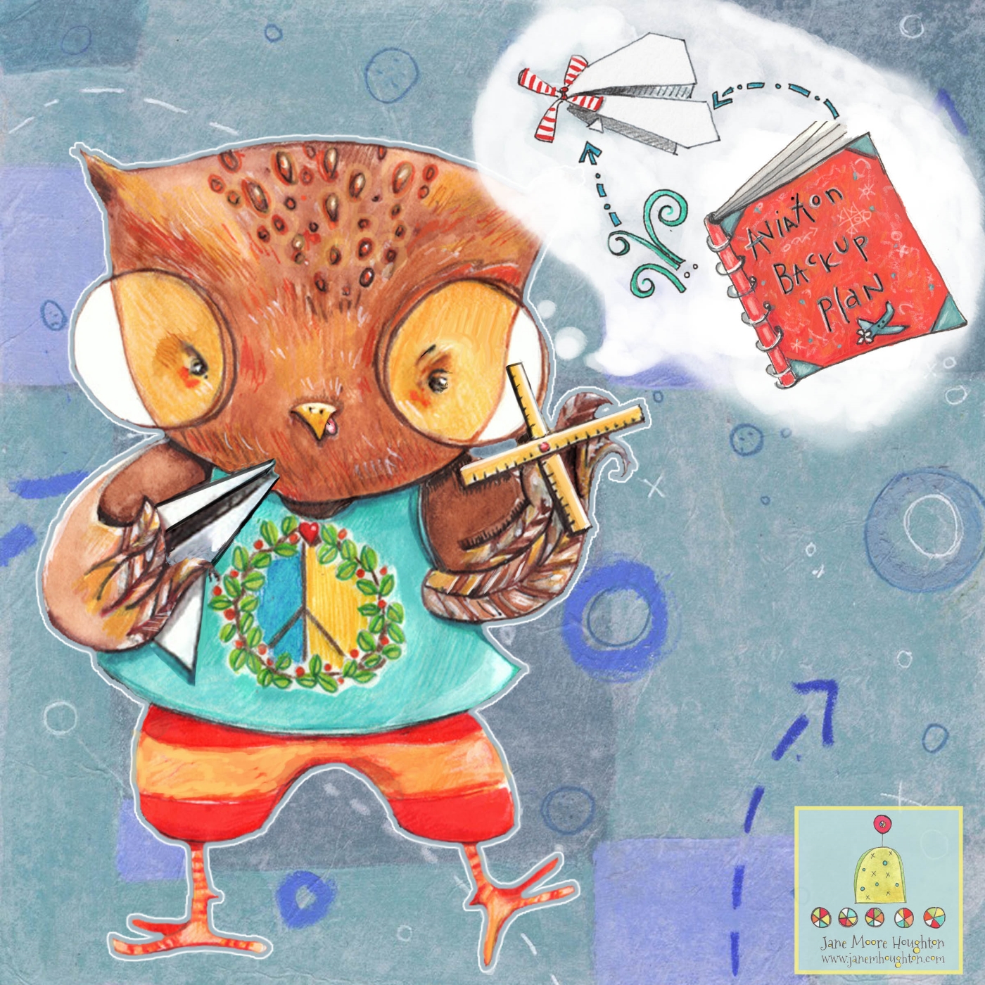
This version was edited a bit - I made the paper airplane in his hand larger. I also made the propeller (made out of rulers) more prevalent in the composition. But, I still felt something was off.
On this latest version, I enlarged the eyes a bit to encourage a deeper connection to the character. I would welcome any feedback on how to make this image more powerful before I move on to another scenario for this guy who is still nameless.
