I have adopted a few new practices that I wanted to share with you....
the new daily journaling technique
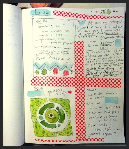
- As I mentioned in the last blog post, I am enrolled in the 2015 Year of the Spark with Carla Sonheim and Lynn Whipple. One of the techniques that Carla has shared is her practice of daily note taking and or journaling. I have adapted it a bit to fit my needs on a given day. The technique is to divide the daily page into small sections. It's less overwhelming then a big blank page and I can adapt the sections to meet my needs on a given day.
- I have started several different practices to help me move my work in a natural and authentic way. I do this periodically to confuse those creative muscles. I wrote some random themes or imagery impressions on small pieces of paper and folded them up and mixed them together in a small container (photo below). I then might pick two or three of these themes and see what imagery ideas come to mind. For example; what might an Indian-themed circus quilt illustration look like? I also pick a few of the 'object' cards to see if it might work in a composition. For example, I might pull a "skeleton key" card and try to see if that shape might work in the piece. Just to shake things up.
- I've been brainstorming ways to rethink my typical go-to composition comfort zone. To do this, sometimes I just browse on Pinterest to look at other artist's work. To see how they solve a problem of telling a story or highlighting shape or movement. I look at how they use the edge of the piece. Do they always follow the 'rules' of Classical balance? If not, why does it work anyway? This past week I was brought back to a composition concept that I have long been drawn to: the map or aerial view.
Two artists came to mind when I began my research and brainstorming about this perspective:
First, is Barbara Neulinger, Barbara was a fellow Skidmore College art student with me. She was a few years older than me and I always admired her work. I remember Barbara doing a series of works all done from the perspective of a bird (it seemed) looking down on urban roof tops. I loved the abstraction of her perspective - so far from the way I was thinking about composition at the time.
Second, is an Australian artist named Marina Strocchi that brings to my mind garden maps. She uses flattened perspective that is rich with pattern and folk imagery. Her palette is limited, highlighting the simplicity of shape and repetition.
I have always been fascinated by maps, particularly illustrated maps. Perhaps this is the influence of my father's long career in civil engineering. I learned how to read a map almost before I could read. I have been collecting images of maps and aerial perspectives on a Pinterest board for a while now, not knowing if and when the influence of these images would pop up.
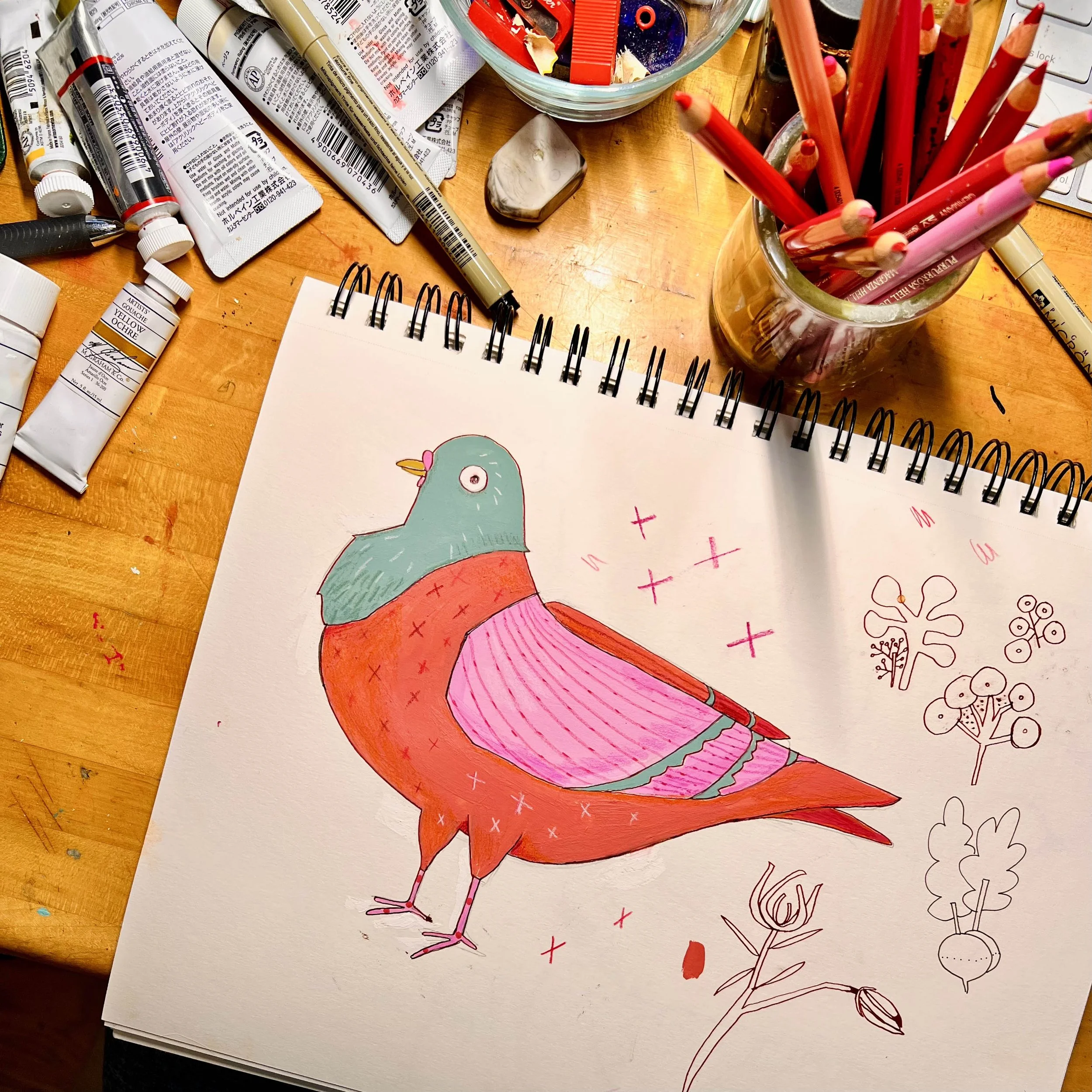
a page from my sketchbook...brainstorming flattened perspective/map-like composition
How do you shake up your way of working...in the studio, kitchen, garden, computer?
